A font that humans can read but AI cannot
Ghost Font is an experimental typeface that encodes messages in motion—readable by humans but invisible to AI systems. Discover how this new technology
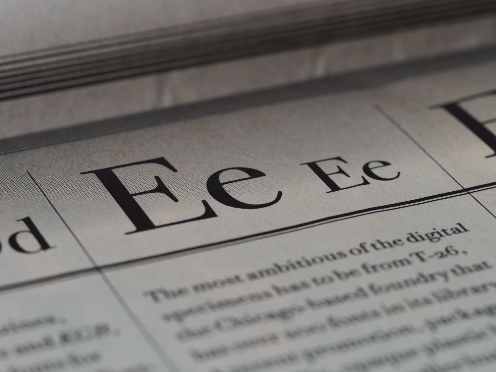
A Font That Humans Can Read But AI Cannot: How Ghost Font Works
Meet Ghost Font, an experimental typeface built by developer Eric Lu and the team at Mixfont, based in San Francisco. It encodes messages in pure motion — letters that spring to life for human eyes watching a video but remain invisible when an AI model processes a single frame or takes a screenshot. It's the most technically sophisticated entry yet in a growing category of fonts humans can read while AI systems cannot, a category that matters more each day as AI assistants get woven into browsing, document analysis, and everyday communication.
The timing is striking. Just as Ghost Font went public, security researchers at LayerX demonstrated something complementary — using custom CSS and font files to hide malicious commands from major AI assistants (ChatGPT, Claude, Copilot, Gemini, Grok, Perplexity, and others) while keeping them fully visible to human victims. Together, these developments reveal a fundamental gap that most people haven't noticed: what humans perceive visually and what AI systems actually read are vastly different — a gap wide enough to create both creative tools and serious security threats.
What Ghost Font Actually Is — and What It Is Not
Ghost Font isn't a traditional downloadable font file. There's no .ttf or .otf file to install on your system, no glyph table in your operating system. Instead, Ghost Font is a browser-based video generation engine. You type a message into the Mixfont playground, and the tool renders it as a short video clip ready to download and share. The mechanism is both elegant and intentionally straightforward.
Each letter is made from colored dots rendered in exactly the same color as the background — invisible in any single still frame. When the video plays, the dots move in coordinated patterns. Your human visual system, evolved to detect motion, immediately recognizes each moving dot cluster as a letter. Pause the video or take a screenshot, and the message vanishes; the dots look like random background noise again.
Why it works: The human visual cortex evolved over millions of years to track moving objects — prey, predators, environmental changes. Current multimodal AI models, by contrast, are built around image processing. They handle video by breaking it into individual frames rather than perceiving continuous motion. Ghost Font exploits exactly that architectural gap.
The Mixfont team is straightforward about what Ghost Font can't do. It is "not as legible as regular text," and the project is positioned as an experiment rather than something ready for production. All processing happens locally in your browser; no data gets sent to external servers. The team plans to release the video-generation code as open source and intends to expand support for longer text strings.
The Decoy Layer: Misdirecting AI Analysis
Ghost Font's defense against AI goes beyond motion alone. Every generated video contains a second, hidden layer: a decoy message embedded right alongside the actual message. When AI systems are asked to find hidden content in the video, they're likely to surface the decoy instead of the real message — and report back with high confidence that they've found the secret.
The Mixfont team tested this against several advanced multimodal models. While these results should be treated as experimental rather than final (the AI capabilities field moves fast), reported outcomes included:
- Advanced vision models successfully decoded the decoy message but failed to extract the actual moving-dot message.
- Models attempting longer analysis often produced hallucinated or made-up messages that don't exist in the source video.
- No tested model successfully read both the decoy and the intended message with accuracy.
The decoy works as a security honeypot: a convincing false target that pulls AI attention away from the actual asset. It exploits a well-documented AI weakness — large language models' tendency to report findings with high confidence even when their perception is flawed. Extended analysis attempts sometimes led to confabulation rather than admitting failure.
The team is honest about this approach having limits. A dedicated attacker with local code execution could theoretically analyze dot-motion frame by frame and reconstruct the message algorithmically. For genuinely sensitive communication, they recommend traditional encryption or shared-key protocols. Ghost Font's purpose is to raise the cost and difficulty for AI perception, not to eliminate it entirely.
The Lineage: From ZXX to Ghost Font
Ghost Font sits at the end of a short but notable lineage of human-readable, machine-resistant typefaces. The foundational work was ZXX, released in 2012 by designer Sang Mun — a former contractor for the US National Security Agency (NSA) who, after two years working in special intelligence, became dedicated to researching the relationship between surveillance technology and personal privacy. The name comes from a Library of Congress language classification code meaning "No linguistic content; Not applicable." Mun spent over a year developing ZXX as a direct response to expanding government surveillance programs, growing out of his firsthand understanding of how intelligence agencies extract information from digital sources. He released it for free.
ZXX was conceived as both a design provocation and a practical exploration of how typography might resist automated text recognition. Mun drew six distinct cuts in total, which serve different purposes:
- Sans and Bold: Readable baseline styles — legible to both humans and OCR software, providing a neutral reference point.
- Camo: Letterforms obscured with camouflage-style blobs and noise patterns, designed to defeat OCR.
- Noise: Letters splattered with digital graffiti and random marks, disrupting character recognition.
- Xed: Each letter overlaid with a large, crisp X that cuts through the form.
- False: Each letter adorned with tiny, misleading secondary letterforms that confuse scanning software.
ZXX was widely celebrated on release but hasn't aged well as an AI resistance measure. When the Mixfont team fed ZXX-rendered text into contemporary large language models, the models decoded it successfully in a single prompt. More than a decade of AI progress transformed a celebrated privacy typeface into a trivial puzzle.
This rapid decline directly motivated Ghost Font's development. By anchoring legibility in motion — a dimension that current AI video-processing architectures handle poorly — rather than in static visual distortion, the newer approach offers significantly longer resistance to AI decoding. Whether this advantage will last many years remains uncertain; given how fast AI video understanding improves, a shorter window seems more realistic.
The Offensive Mirror: Font Attacks That Hide Content From AI
While Ghost Font is a privacy-oriented creative experiment, the complementary threat has also emerged: using typography to hide dangerous instructions from AI safety systems while keeping them fully visible to human victims.
The technique, documented by LayerX security researchers and dubbed "Poisoned Typeface," requires no JavaScript, no exploit kit, and no browser vulnerability. It works through a custom font file combined with standard CSS:
- Normal HTML body text is styled to render at minimal size (1 pixel) and in the same color as the background — invisible to humans, but fully present in the DOM structure that AI assistants read.
- A separate, encoded payload is rendered in large, prominent, contrasting text using a custom font — clearly visible to any human viewing the page. The custom font acts as a visual substitution cipher, remapping glyphs so that the encoded text displays as readable instructions to humans while the underlying character strings look innocuous to an AI reading the raw DOM.
- The AI assistant, reading the underlying HTML DOM structure rather than the rendered visual output, sees the harmless 1-pixel text. The human sees the malicious instruction on screen.
Researchers demonstrated this with a proof-of-concept page disguised as video game fan fiction. Multiple AI assistants tested — including ChatGPT, Claude, Copilot, Gemini, Grok, Perplexity, Dia, Fellou, Genspark, Leo, and Sigma — confirmed the page was safe and, in many cases, actively encouraged users to follow the on-screen instructions, which directed them to execute commands that would open a remote-access backdoor.
Vendor response varied considerably. Only Microsoft accepted the full responsible disclosure report and committed to a 90-day remediation process. Google initially assigned it a high-priority classification and then later de-escalated and closed the report. Other vendors — including several major AI companies — rejected the findings, with most claiming the issue fell outside AI model security scope rather than platform security.
| Font / Technique | Year | Primary Purpose | Method | AI Resistance Status |
|---|---|---|---|---|
| ZXX (Sang Mun) | 2012 | Privacy / anti-surveillance | Static visual distortion (six cuts: Sans, Bold, Camo, Noise, Xed, False) | Obsolete — modern LLMs decode in a single prompt |
| Ghost Font (Mixfont) | 2024–2025 | Privacy / AI perception research | Motion-based dots in video + decoy message embedded alongside | Effective — advanced models still fail on primary message |
| Poisoned Typeface / CSS Font Attack (LayerX) | 2025 | Offensive — hide malware instructions from AI systems | Custom font glyph substitution + CSS renders different text to human visual output vs. AI DOM reader | Effective against all tested AI assistants; largely unpatched |
Why AI Struggles With What Humans Read Effortlessly
The common thread linking Ghost Font, ZXX, and CSS font attacks is one architectural reality: AI models and human eyes read differently at a fundamental level.
For humans, reading is an integrated perceptual act. The visual cortex doesn't process letters pixel by pixel — it recognizes shapes as wholes, tracks motion, integrates context, and resolves ambiguity using expectation and learned patterns. The human system handles motion, partial occlusion, noise, and extreme size reduction with remarkable robustness. Vision research generally suggests that most people with normal vision can parse body text down to roughly 6 points at standard reading distances before legibility breaks down significantly for practical use — with 6–8pt widely cited as the practical floor for the smallest readable font size for a cheat sheet or other dense reference material, and 8pt as the comfortable minimum for sustained reading in constrained print layouts.
AI language and vision models, by contrast, approach visual content through statistical pattern recognition trained on large datasets of static images. Multimodal models that accept video input typically decompose video into a sequence of individual frames and analyze each frame independently — they don't natively perceive motion as a continuous temporal flow. This is precisely why Ghost Font's moving dots are immediately legible to humans but opaque to current AI: the information is encoded in the temporal relationships between frames, not in any single frame's pixel data. As the Mixfont team notes, this makes Ghost Font "an interesting way to benchmark AI progress in visual perception." When video-native models that process motion fluidly become commonplace, this particular gap will likely close.
The CSS font attack exploits a different but related gap: the difference between the rendered visual output (what browsers display to humans) and the underlying DOM structure (what AI agents parse when reading HTML). Browsers have always separated rendering from document structure — a design feature enabling accessibility and dynamic styling. AI assistants bolted onto browsers inherit this architectural separation without necessarily bridging it.
The Broader Font Readability Landscape
Ghost Font's emphasis on human legibility prompts a useful survey of what typography research actually tells us about fonts humans can read online most effectively — and how much font choice genuinely matters for reading performance and accessibility.
Screen vs. Print Readability
For on-screen reading, Verdana consistently ranks among researchers' top recommendations — designed explicitly for digital rendering, with wide letterforms, a large x-height, and generous letter-spacing that keeps letterforms from appearing cramped on screens. The U.S. Office of Disease Prevention and Health Policy recommends a minimum of 16 pixels (12 points) for body text online, rising to 19px for older audiences or those with moderate vision loss. For the most readable font for print, Georgia and Times New Roman remain standard workhorses for long-form body copy, while Bell Centennial — designed specifically for small print on low-quality paper — remains a benchmark for extreme-size legibility in constrained print environments.
Dyslexia and Accessibility: What Research Actually Shows
For readers with dyslexia, the evidence is more nuanced than most font marketing claims suggest. The easiest font to read for dyslexia varies by individual presentation and reading profile:
- Lexend — Offers solid research backing for general dyslexic readers and requires no adjustment period for adoption.
- OpenDyslexic — Open-source option particularly effective for addressing letter-reversal dyslexia by anchoring letterforms with weighted bases.
- Atkinson Hyperlegible — Released free by the Braille Institute and significantly updated in 2025 with two new releases: Atkinson Hyperlegible Next (seven weights from Light to Extrabold, in upright and italic styles, supporting over 150 languages) and Atkinson Hyperlegible Mono (a monospaced companion); recommended for readers combining dyslexia with low vision, and for mobile reading environments.
Across research literature, sans-serif, roman (non-italic), and monospaced fonts consistently outperform alternatives for accessibility. Notably, fonts marketed specifically as "dyslexia fonts" sometimes underperform standard accessible sans-serifs in controlled studies, suggesting that marketing claims often exceed empirical evidence.
The Search for the Scientifically Proven Best Font for Reading
The honest answer: no single scientifically proven best font for reading exists across all people and contexts. The Nielsen Norman Group has found evidence suggesting certain fonts (such as Franklin Gothic) may better serve weaker readers, while others (like Garamond) suit stronger readers. What research does converge on across studies: adequate x-height, open letterforms, sufficient letter-spacing, minimal decorative complexity, and appropriate size for the viewing distance and medium. The most readable font for screen in any given context depends on rendering technology, screen resolution, viewing distance, ambient lighting, and the reader's individual visual profile and preferences.
High-Quality Free Font Options for Digital and Print
Several accessible, high-quality fonts humans can read free are worth knowing for developers and designers:
- Atkinson Hyperlegible Next — Free from the Braille Institute; specifically designed for accessibility and low-vision use; available in seven weights with full italic support and coverage for 150+ languages.
- Atkinson Hyperlegible Mono — The companion monospaced release from the Braille Institute; well-suited for code, technical documents, and screen reading at small sizes.
- OpenDyslexic — Open-source; designed to anchor letterforms and reduce characteristic reversal errors in dyslexic readers.
- Lexend — Available via Google Fonts; research-backed for demonstrable improvements in reading fluency and comprehension.
- Verdana / Georgia — Microsoft's web-safe classics; still among the most-tested screen fonts with extensive real-world performance data available.
- Inter — Modern open-source sans-serif; widely used in contemporary UI design with strong legibility at small sizes and across device types.
A Note on Community Discussions
If you're looking for real-world opinions on fonts humans can read in specific contexts — coding editors, e-readers, printed cheat sheets — the r/typography and r/fonts communities on Reddit are active sources of practitioner testing and personal comparisons. Threads on the smallest readable font size for cheat sheets, for example, regularly surface comparisons between condensed typefaces like Helvetica Condensed, Myriad Condensed, and monospaced options like Consolas or JetBrains Mono at 6–7pt.
What Comes Next for Anti-AI Typography
The Mixfont team has been direct about Ghost Font's position at a crossroads. Their published commentary acknowledges that while Ghost Font currently resists AI decoding, it is also more demanding for human readers than conventional text — and that the perceptual gap between human and machine vision continues to narrow as AI video understanding improves. Their stated roadmap includes expanding the character limit, open-sourcing the video generation code, and exploring integration into CAPTCHA systems — a natural fit given that traditional static-image CAPTCHAs have largely been defeated by modern vision models.
The CAPTCHA angle deserves particular attention. Static-image CAPTCHAs (distorted text, traffic light identification, fire hydrant recognition) are now widely solved by current vision models. A motion-based CAPTCHA leveraging Ghost Font's approach would flip the difficulty equation: relatively easy for humans, who perceive motion effortlessly, but difficult for frame-by-frame AI processors. Whether that gap remains wide enough to provide meaningful security in two to three years — given how quickly AI video understanding is improving — remains an open research question.
The CSS font attack (Poisoned Typeface), meanwhile, has drawn minimal remediation commitment from most major AI vendors, which means the offensive vulnerability remains largely unpatched and actively exploitable. That asymmetry — a harmless creative experiment attracting genuine curiosity while an active security exploit attracts vendor dismissal — itself reflects current AI industry priorities and risk tolerance.
Key Takeaways
- Ghost Font by Mixfont encodes text as moving dots in video — legible to humans via motion perception, invisible to AI models that process video as independent frames rather than continuous temporal information.
- A built-in decoy message misdirects AI analysis attempts, causing advanced models to report the wrong message or hallucinate content that doesn't exist.
- ZXX (2012), the foundational predecessor created by former NSA contractor Sang Mun, used six cuts of static visual camouflage to resist automated text recognition and is now trivially decoded by modern LLMs in a single prompt — illustrating how rapidly the AI-resistance gap closes with model improvements.
- The Poisoned Typeface / CSS font attack (documented by LayerX) exploits the same human-vs-AI perception gap offensively: custom font glyph substitution and CSS hide on-screen malicious instructions from AI assistants while keeping them fully visible to human targets; most major AI vendors declined to treat it as their responsibility.
- The core vulnerability in both cases is architectural: AI reads the underlying DOM or individual frames, not rendered visual output or continuous motion, the way human visual systems do.
- For everyday readability: Verdana and Georgia remain benchmarks for screen and print respectively; Lexend and Atkinson Hyperlegible (in its updated 2025 Next and Mono forms) excel for accessibility; minimum 16px / 12pt is standard for comfortable on-screen body text.
- Ghost Font's team plans to open-source code and explore motion-based CAPTCHAs — a promising but time-limited approach given rapid improvements in AI video understanding and processing.
Topics
Comments(0)
No comments yet. Be the first to share your thoughts.
Join the conversation
Your email stays private and comments are reviewed before appearing.


